Using Figma Auto Layout to Build Responsive Button Groups
Learn how Figma’s Auto Layout creates responsive frames that behave like flexbox, with a step‑by‑step button‑group example, performance notes, and verification steps.
05 Feb 2026, 15:49 UTC
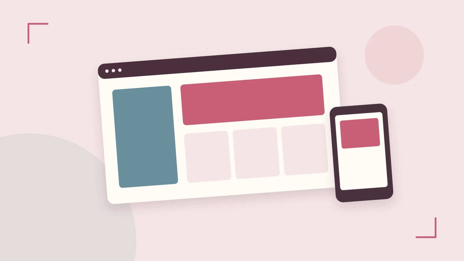
Problem: Designing buttons that stay aligned when the container resizes
When a toolbar or card needs to grow or shrink, manually moving each button becomes tedious and error‑prone. Designers want a way to let the layout adjust automatically while keeping control over spacing, alignment, and occasional exceptions.
Thesis: Figma’s Auto Layout turns a static frame into a flexible container that behaves like CSS flexbox, letting you define direction, spacing, padding, and alignment once and have the UI respond to size changes.
1. Auto Layout basics
Auto Layout is enabled on a frame via the right‑hand panel. Once turned on, the frame’s children are laid out according to:
- Direction – horizontal or vertical (or wrap).
- Spacing – gap between siblings.
- Padding – internal space on all sides (or individually).
- Alignment – how children are positioned along the cross axis.
- Sizing – fixed, hug contents, or fill container; you can also set min/max width/height.
Changing any of these values updates the canvas instantly, and the same logic is reflected in the code snippet exported from Dev Mode.
2. Worked example: a responsive button group
- Create a frame (press
F) and name itButtonGroup. - With the frame selected, click the Auto Layout button in the properties panel.
- Set Direction to
Horizontal, Spacing to8px, and Padding to12pxon all sides. - Set the frame’s Width to
Fill containerso it expands with its parent. - Add three rectangle objects (
R) inside the frame; rename themBtn1,Btn2,Btn3.- Give each a fixed height of
36pxand set Width toHug contents. - Add a text layer inside each rectangle for the label.
- Give each a fixed height of
- Resize the
ButtonGroupframe by dragging its right edge. Notice the buttons stay spaced 8px apart and the padding remains 12px; the outer frame grows or shrinks while the children keep their internal dimensions. - To make one button stay fixed (e.g., an icon that should not move with the flow), select that child, enable Absolute position in the Auto Layout section, and drag it to the desired spot. It now moves independently but remains inside the parent frame.
- Open Dev Mode (
Shift+I), select theButtonGroupframe, and click Copy as CSS. The pasted snippet will contain rules similar to:
.ButtonGroup {
  display: flex;
  flex-direction: row;
  gap: 8px;               /* corresponds to Spacing */
  padding: 12px;          /* corresponds to Padding */
  align-items: flex-start;/* Alignment */
}
.ButtonGroup > * {
  flex: 0 0 auto;         /* Hug contents */
  height: 36px;
}
This shows how Auto Layout settings map directly to flexbox properties, making the design ready for handoff.
3. Trade‑offs and limitations
- Performance – Deeply nested Auto Layout frames with many objects can slow canvas interactions, especially in files with hundreds of components. Keep nesting shallow when possible.
- CSS feature gaps** – Auto Layout maps to flexbox; it does not generate CSS grid properties like
grid-template-areasor custom transform origins. For those layouts you may need a plugin or manual adjustments after export. - Absolute position caveat** – While useful for exceptions, over‑using absolute positioning defeats the purpose of a responsive flow and can lead to inconsistent spacing when the parent resizes.
To check whether performance is acceptable, open the file, enable Show pixel grid and Show layout grids, then scroll or zoom. If the canvas feels laggy, consider flattening nested frames or converting some groups to regular frames.
Actionable closing
Start by applying Auto Layout to any container that needs to grow or shrink—toolbars, cards, lists. Define direction, spacing, and padding once, then test by resizing the frame. Use absolute positioning sparingly for items that truly break the flow, and verify the exported CSS in Dev Mode to ensure the design translates correctly to code. With these steps you’ll gain a responsive layout that reduces manual tweaking and improves handoff fidelity.
 figma
figma0 replies
A thoughtful contribution can make all the difference. Be the first to share one.