Stop duplicating artboards for every button state in Adobe XD
Use Adobe XD component states to prototype hover, pressed, and disabled button interactions in one component instead of managing separate artboards.
04 Aug 2026, 06:38 UTC
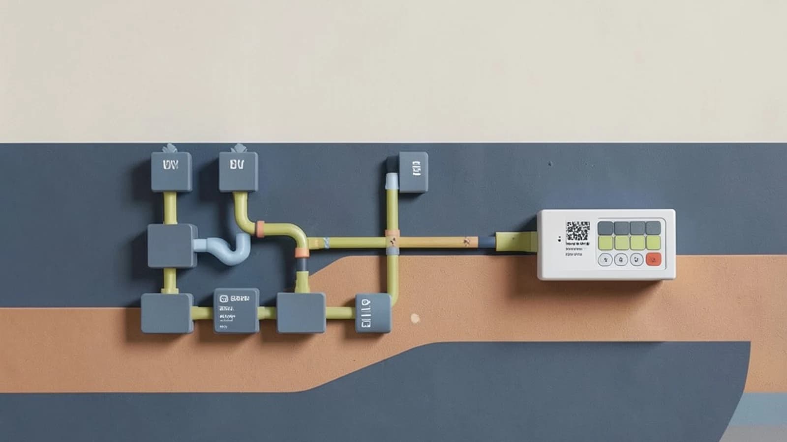
One artboard per button state is a maintenance trap
A common way to prototype a button in Adobe XD is to draw one artboard for the default state, another for hover, another for pressed, and another for disabled. If the button appears on five screens, you now have twenty artboards to track. Change the label or corner radius, and you must repeat the edit everywhere. Prototypes also become harder to share because each state lives in a different place.
The useful takeaway: Adobe XD component states let you store default, hover, pressed, disabled, and custom toggle states inside a single main component. You then wire one prototype interaction to switch between those states instead of linking separate artboards.
How component states work
A component is a reusable design object. When you convert a button to a component, XD treats it as a source of truth: instances placed across artboards update when the main component changes. Component states are variations of that same component. A state is not a separate artboard or a duplicated layer group; it is a named variation stored inside the component definition.
States appear in the Properties Inspector under the States section. You can add built-in states such as Hover and Pressed, plus custom states such as Disabled or Selected. Each state can have its own colors, borders, shadows, and text styling.
Worked example: prototype a button without extra artboards
- Create the button. Draw a rectangle, add a text label on top, and select both.
- Make it a component. Use the component command in your XD version to turn the selection into a main component.
- Open States. With the component selected, look in the Properties Inspector for the States section and click Add State.
- Add the states you need. Add Hover, Pressed, and Disabled, or create custom states by clicking the plus icon and naming them. Keep the list short; deep nesting makes the component harder to manage.
- Style each state. Select Hover and change the fill or border to show feedback. Select Pressed and darken the background or shift the shadow. Select Disabled and reduce opacity or gray out the text.
- Set the default state. In the States panel, mark Default State as the starting appearance. This is what users see before any interaction.
- Wire the interaction. Switch to Prototype mode, select the component instance on your artboard, and add a Tap trigger. Set the action to Change to State and choose Pressed. You can add a second interaction to return to Default State on release if your XD version supports it.
- Preview. Open the Preview window, tap the button, and confirm the visual switches to Pressed and back.
Expected check: The button should change appearance immediately on tap without navigating to another artboard. If nothing happens, confirm the trigger is attached to the component instance and not to an inner layer such as the text label.
Risk: Renaming or deleting a state that is already wired in a prototype can break that interaction. Document which states your prototype references before you clean up the States panel.
Trade-offs and limitations
- This is prototyping, not code. Values shown in the XD property inspector—padding, shadow, font weight—are design approximations. Frontend engineers must re-implement the button in CSS or your component library; do not copy XD numbers directly into production stylesheets.
- Tool availability changes. Adobe XD licensing and update status have shifted over time. Before starting a design-system project in XD, check the Help or About screen and your organization admin console for current support and end-of-life notices.
- States are not conditional logic. Avoid using states for multi-step flows or complex validation. For those, use separate artboards with auto-animate or keep the prototype linear.
Verify before you hand off
Open Adobe XD, create one button component, add Hover and Pressed states, wire a Tap interaction to change state, and preview it. Then check Help > About to confirm your XD version and update channel. If your organization manages licenses, verify with your admin that XD is still supported for cloud documents and coediting before you commit files to a shared design system.
Component states solve the artboard duplication problem for simple button feedback, but they are a communication tool for designers and stakeholders—not a replacement for implemented UI code.
 xd
xd0 replies
A thoughtful contribution can make all the difference. Be the first to share one.