Master Materialize CSS’s Responsive Grid: How to Build Fluid Layouts That Never Break
Learn how Materialize CSS’s 12‑unit responsive grid works, see a step‑by‑step example, and avoid common pitfalls like misusing push/pull or hard‑coding widths. Build mobile‑first layouts that scale seamlessly across devices.
09 May 2026, 18:11 UTC
Why the Grid Matters
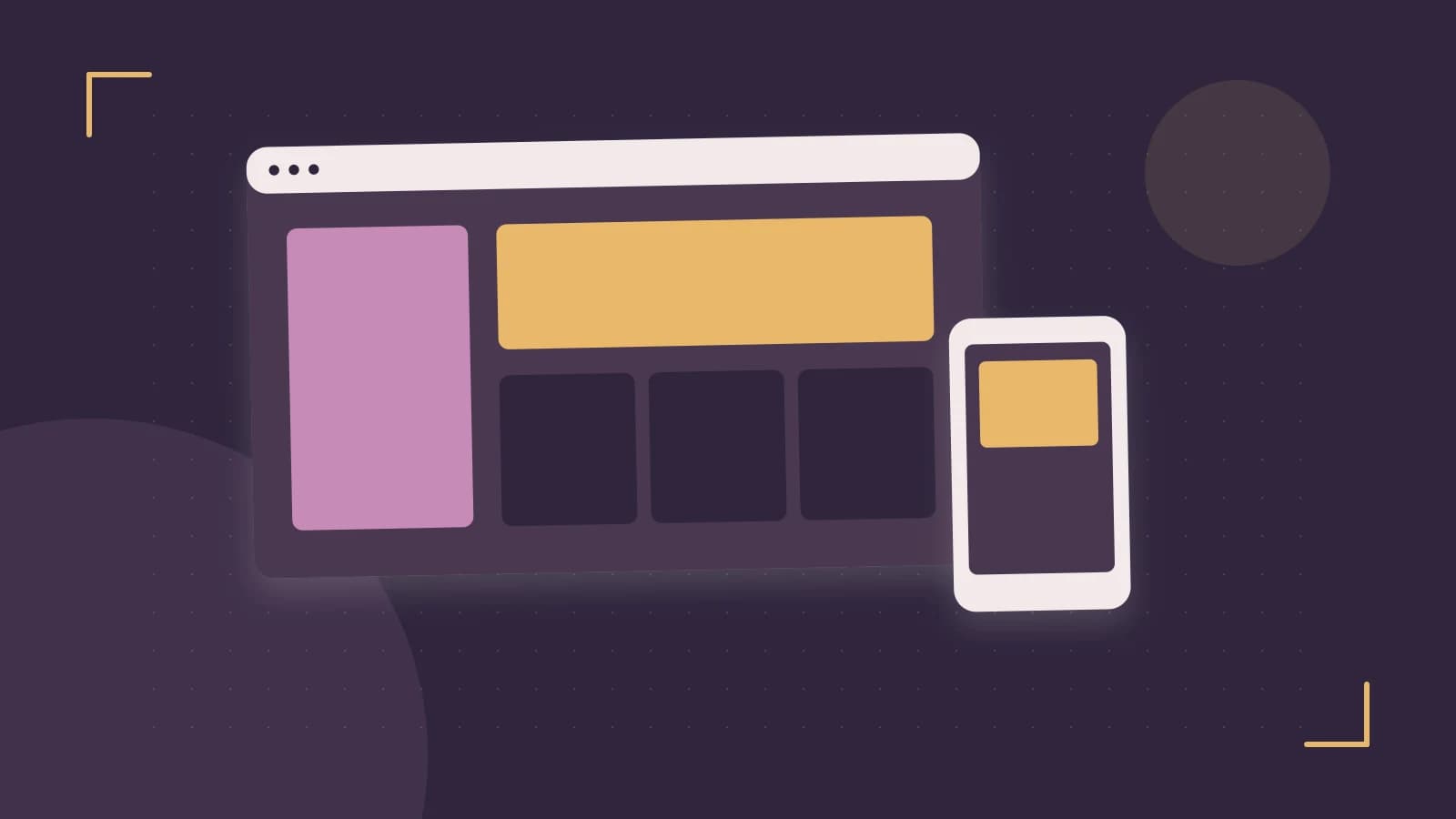
When you design for the web today, you can’t ignore the fact that users view pages on phones, tablets, laptops, and desktops. Materialize CSS solves this by offering a 12‑unit, mobile‑first grid system that automatically adapts to screen size. The key benefit is that you declare how many columns an element should span at each breakpoint, and the framework handles the rest—no media queries, no manual flex math, no layout breakage when you resize.
Core Mechanics
At the heart of the grid are two building blocks: row and col. The row class creates a flex container that holds columns. Each col class specifies the number of 12‑unit cells the element occupies at a given breakpoint. The breakpoints are:
s– Small (mobile‑first, < 600 px)m– Medium (tablet, 600–992 px)l– Large (desktop, >992 px)
For example, col s12 m6 l4 means: on small screens, take up the full width (12/12); on medium screens, take half the width (6/12); on large screens, take one‑third of the width (4/12). Materialize calculates the column width as a percentage of the row’s width, so the layout stays fluid.
Offset, Push, and Pull
Sometimes you need to shift a column to the right or reorder it. offset- classes move a column by a set number of cells. For instance, offset-m3 adds a 25% left margin on medium screens. push- and pull- change the visual order without affecting the markup order—useful for responsive design patterns like “image first on desktop, text first on mobile.”
Hiding Elements
Materialize offers hide-on-small-only, hide-on-med-only, etc., to control visibility at breakpoints. This is handy for showing a simplified layout on phones while keeping the full feature set on larger screens.
Worked Example
Below is a minimal HTML snippet that demonstrates a three‑column row that collapses to full width on mobile, halves on tablets, and shows all columns on desktop. It also centers the middle column on medium screens using an offset.
<!-- index.html – Materialize CSS from CDN -->
<link href="https://cdnjs.cloudflare.com/ajax/libs/materialize/1.0.0/css/materialize.min.css" rel="stylesheet">
<div class="container">
  <div class="row">
    <div class="col s12 m6 l4">
      <div class="card">
        <div class="card-content"><p>Left column</p></div>
      </div>
    </div>
    <div class="col s12 m6 l4 offset-m3">
      <div class="card">
        <div class="card-content"><p>Center column (offset on m)</p></div>
      </div>
    </div>
    <div class="col s12 m12 l4">
      <div class="card">
        <div class="card-content"><p>Right column</p></div>
      </div>
    </div>
  </div>
</div>
<script src="https://cdnjs.cloudflare.com/ajax/libs/materialize/1.0.0/js/materialize.min.js">
Open the file in a browser and resize the viewport:
- Below 600 px: each card stacks vertically, full width.
- 600–992 px: two cards per row, the middle card is centered because of
offset-m3. - Above 992 px: all three cards sit side‑by‑side, each taking one‑third of the row.
To verify the computed widths, open dev tools, inspect a .col element, and check the flex-basis style. For l4 it should be approximately 33.333%.
Common Pitfalls and How to Avoid Them
Hard‑coding Pixel Widths
Applying style="width:200px;" to a column breaks the flex calculation. On a small screen the column will overflow the row, causing horizontal scroll. Instead, rely on the grid classes or use max-width if you need a cap.
Using Push and Pull Together
Applying both push- and pull- on the same element can create a confusing visual order that is hard to debug. Use one or the other, and test the layout after each change.
Over‑nesting Rows Inside Columns
While nesting is allowed, remember that each row adds negative left/right margins to counter the column gutters. If you nest a row inside a col without clearing, the inner columns may shift unexpectedly. Always wrap nested rows in their own container or clear the float.
Neglecting Hide Classes
When you need a mobile‑only element, use hide-on-large-only etc., rather than setting display:none; via CSS. The Materialize hide classes are part of the cascade and work with the grid’s flexbox layout.
Limitations
- The grid is strictly 12 columns; if you need more granular control, you’ll need to write custom CSS.
- Materialize’s grid is designed for simple, content‑centric layouts. Complex, multi‑row nested structures can become hard to maintain without a clear naming convention.
- Because it relies on flexbox, very old browsers (IE 10 and below) will not support the grid. For legacy support, consider a fallback or polyfill.
Putting It All Together
When you start a new project, create a layout.html that defines your row and col structure. Keep the breakpoints consistent: always start with s12 to guarantee mobile‑first behavior, then add m and l as needed. If you need to shift or reorder, use offset-, push-, or pull- sparingly and test on all target devices.
Finally, remember to use dev tools to inspect flex-basis and margin-left for offset calculations. This quick check will confirm that your grid behaves as expected before you ship the site.
 materializecss
0 replies
A thoughtful contribution can make all the difference. Be the first to share one.