Building Fluid Layouts with Bulma’s Responsive Column System
Learn how Bulma’s column classes and responsive modifiers let you build flexible, nested grids that adapt across devices, with a practical example and notes on limitations.
27 Aug 2025, 01:18 UTC
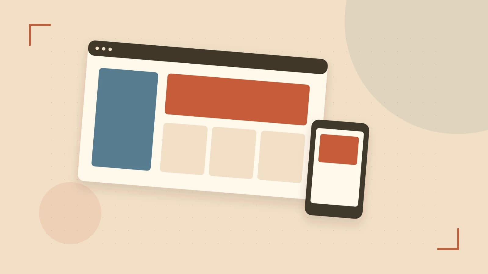
Problem: Layouts that break on different screen sizes
When building a marketing page, you need a two‑column section that shows half width on mobile, third width on tablet, and quarter width on desktop. Writing custom media queries quickly becomes brittle.
How Bulma’s column system solves it
Bulma provides a columns wrapper and column children. Width is set with classes like is-half, is-one-third, is-one-quarter. Responsive modifiers append the breakpoint name, e.g. is-half-mobile applies only at mobile width and up.
Nesting and alignment
A columns element can sit inside another column, inheriting the parent’s width while keeping the gutter. Flexbox helpers such as is-flex and is-align-items-center give equal‑height columns without extra CSS.
Worked example: responsive product grid
<!-- Include Bulma from CDN -->
<link rel="stylesheet" href="https://cdn.jsdelivr.net/npm/bulma@0.9.4/css/bulma.min.css">

<section class="section">
  <div class="container">
    <h1 class="title">Product showcase</h1>
    <div class="columns is-multiline">
      <div class="column is-half-mobile is-one-third-tablet is-one-quarter-desktop">
        <div class="card">
          <div class="card-content">
            <p class="title is-4">Item 1</p>
          </div>
        </div>
      </div>
      <!-- repeat column for more items -->
    </div>
  </div>
</section>
Resize the browser: at widths below 768 px (mobile) each card takes half the row; between 768 px and 1023 px (tablet) it shows three per row; at 1024 px and up (desktop) four per row. The is-multiline modifier lets columns wrap to the next line.
Trade‑off: CSS‑only means no built‑in interactivity
Bulma’s column system is pure CSS, so dropdowns, modals, or tabs need extra JavaScript or a third‑party plugin. If your project already relies on a UI library for those components, you may end up loading two style sets, increasing bundle size.
Customizing breakpoints requires overriding Sass variables ($tablet, $desktop) and rebuilding the CSS, which adds a build step and can complicate future Bulma upgrades.
Actionable steps
- Add the Bulma CSS link to your HTML head.
- Wrap your layout in
<div class="columns"> - Apply the combination of base and responsive width classes to each
<div class="column"> - Test by resizing the browser or using device‑mode in DevTools; verify the applied classes match the expected breakpoint.
- If you need a breakpoint that Bulma does not provide, consider creating a custom Sass build; otherwise, stick to the default set to keep upgrades simple.
With these steps you can create fluid, nested layouts quickly while being aware of where Bulma’s CSS‑only approach may require supplemental JavaScript.
 bulma
bulma0 replies
A thoughtful contribution can make all the difference. Be the first to share one.